A bold, new identity for Romania's leading news channel
Digi24

Digi24 is Romania's leading news brand. In conjunction with Kemistry, we were given the task to refresh and strengthen the Digi24 brand, aligning it with contemporary broadcasting standards while retaining its core values of trust and reliability.
This case study explores the various elements that constitute the new Digi24 brand identity, detailing the strategic redesign and implementation process across different facets of the channel.
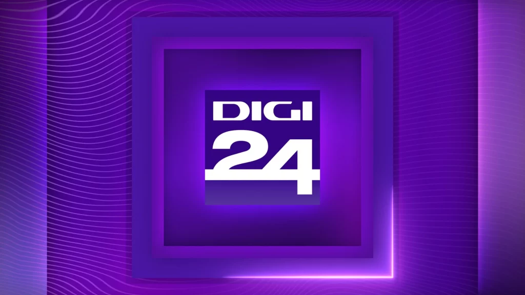
Digi24 Rebrand – Project Showcase
The rebrand aimed to modernise Digi24’s identity, enhancing viewer engagement and ensuring consistency across all platforms. This began with redefining core components such as the logo, typeface, and colour palette to strengthen brand recognition and provide a clear foundation to build upon.
Encompassing the content of the channel, refreshed idents were created with an entirely new look, aesthetic and concept: 'The Digi24 Lens' – a central square that clarifies and captures Romania and the world.
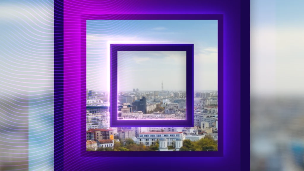
Digi24 – Idents
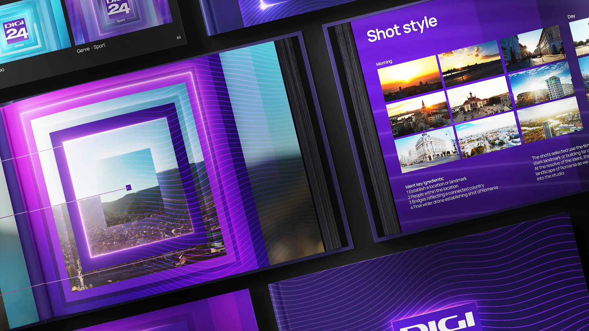
The idents are based around the idea of the ‘Digi24 lens'. This is a square motif that clarifies and captures Romania and the world. The idents reflect the changing light of a day, morning, day, night and can be updated over time with new shots that encapsulate the life and landscape of Romania.
The shots selected use the time-lapse photography often against a stark landmark or building for contrast of history and the contemporary. At the resolve of the ident, the final shot is from a drone showing a wider landscape of Romania as we travel out of the close up ‘Digi24 lens’ and into the studio.
We also created bespoke idents for Digimatinal, the channels flagship breakfast show, which features beautiful sunrises across Romania, softer music which also captures sounds of birdsong, recorded on location in Bucharest.
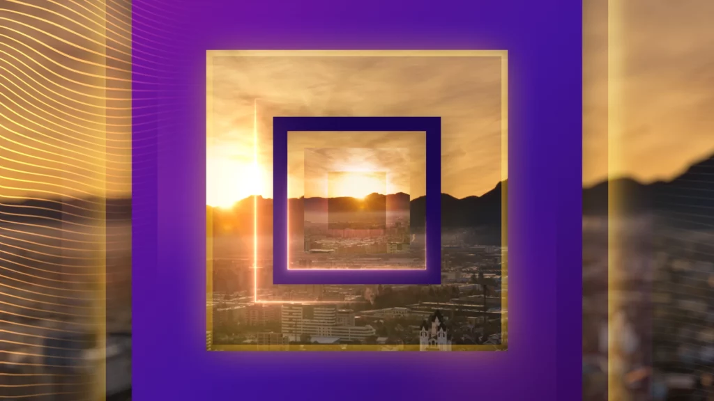
Digi24 - Digimatinal
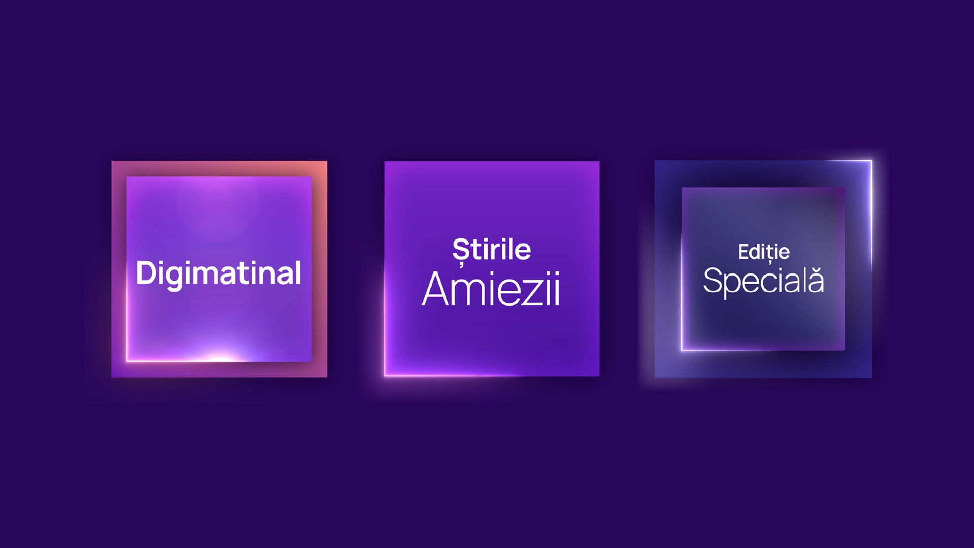
A design system to hold programme brands within the 'Digi24 lens' was also devised bringing strands together under a house style, with subtle variations in colour and sonic identity to change the tone.
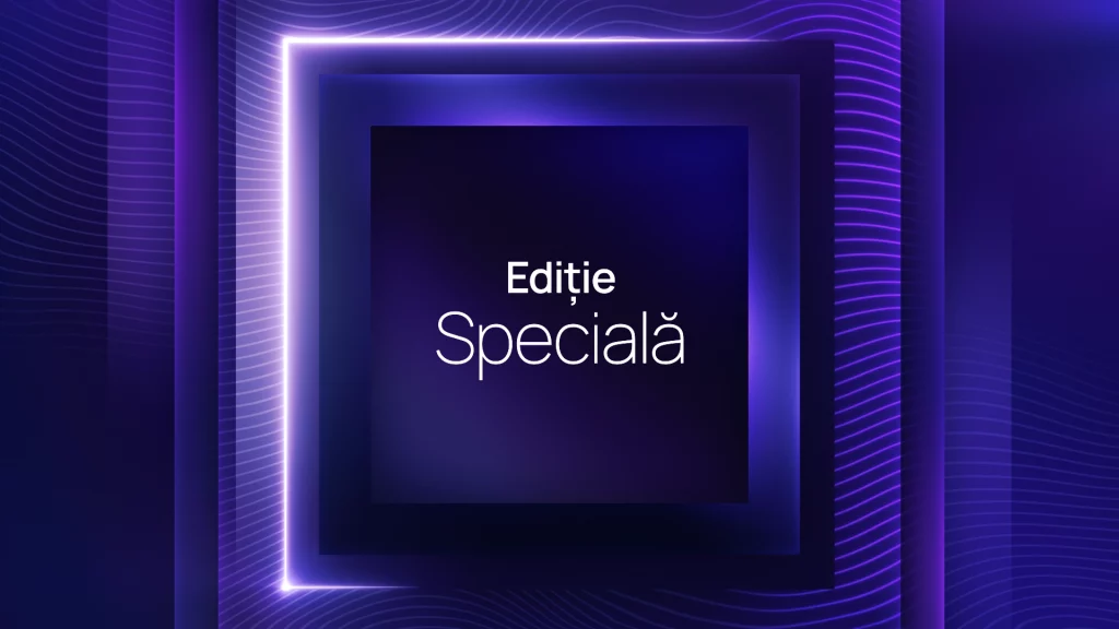
Digi24 - Programme Brands
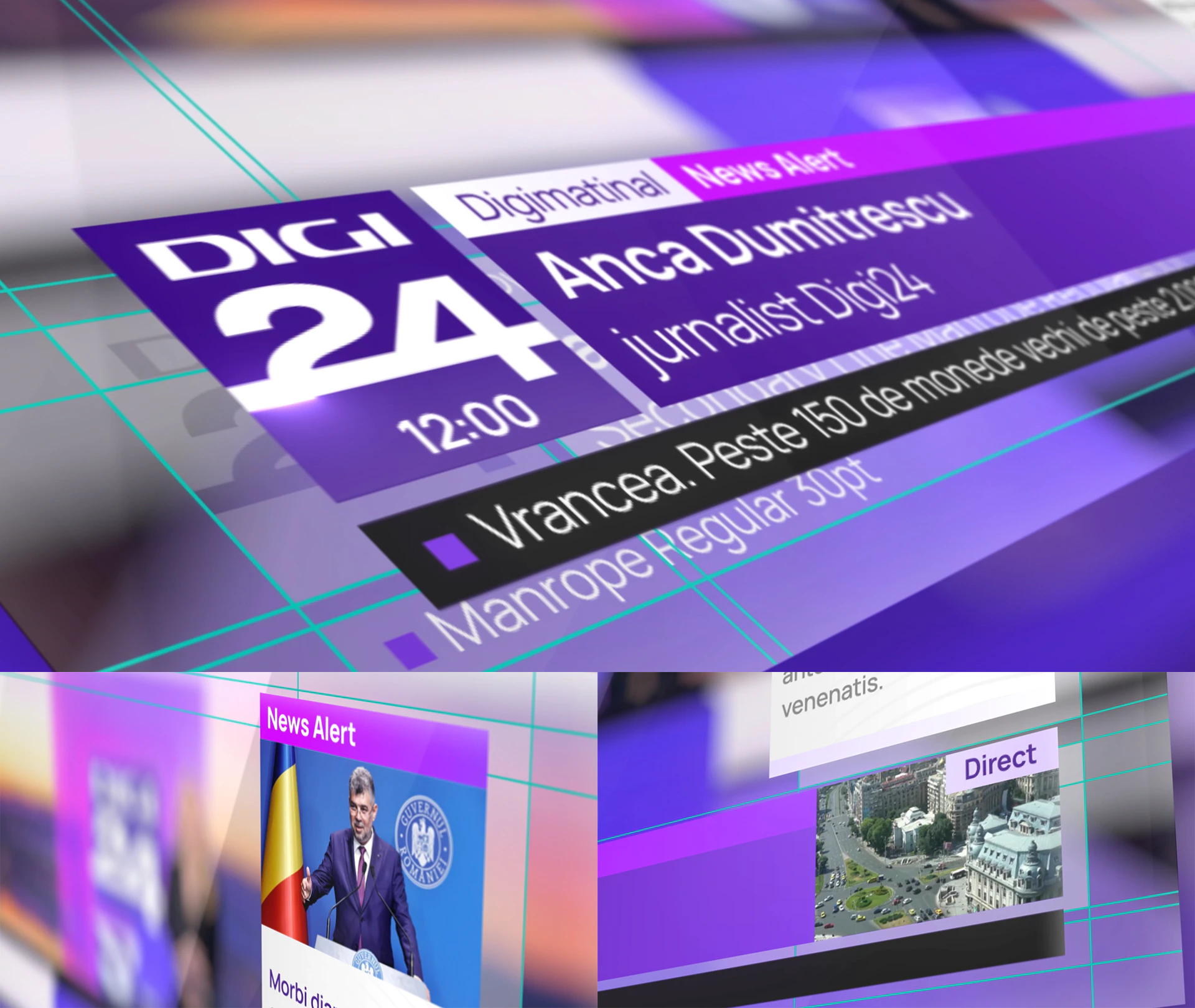
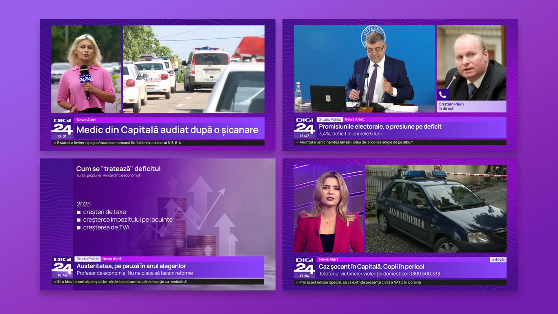
The refresh extended across the on-screen presentation where we introduced a new hierarchy system and content structure, completely overhauling the top-most layer of broadcast graphics. This new framework was redesigned to magnify clarity and bring additional context to viewers.
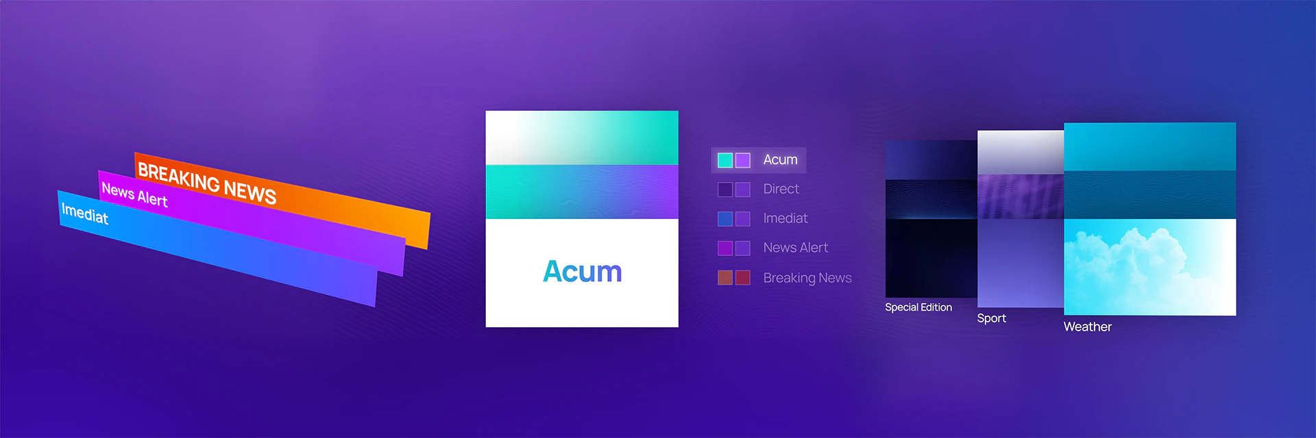
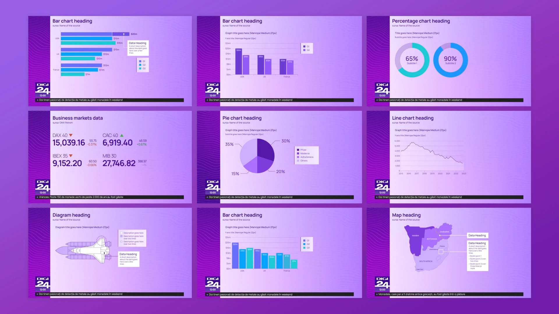
In accompaniment to the new OSP, we gave a new look to the full-frame content by carefully restructuring the visual architecture into a neat, yet flexible grid system. Our aim was to maximise space, clarity and consistency for information to sit, whilst allowing the brand a consistent presence within the frame.
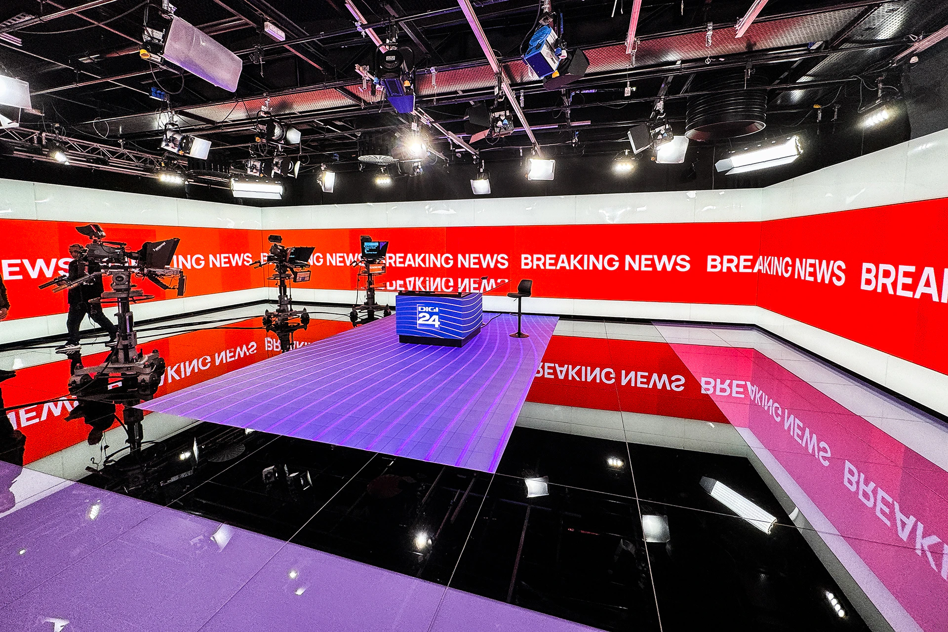
Set Designer Trond Olav Erga designed two new studio spaces. Studio 1 is a flexible and versatile studio featuring 360 degree LED explainer wall. The whole space from the walls, floor and desk design can easily be transformed and work together. Studio 2 features a rounded desk suited to discussion formats, with screens wrapping the desk and walls allowing programme branding to take over the space. There are 6 core set looks; Morning, Day, Dusk, Night, Generic, along with a special mode for Breaking News.

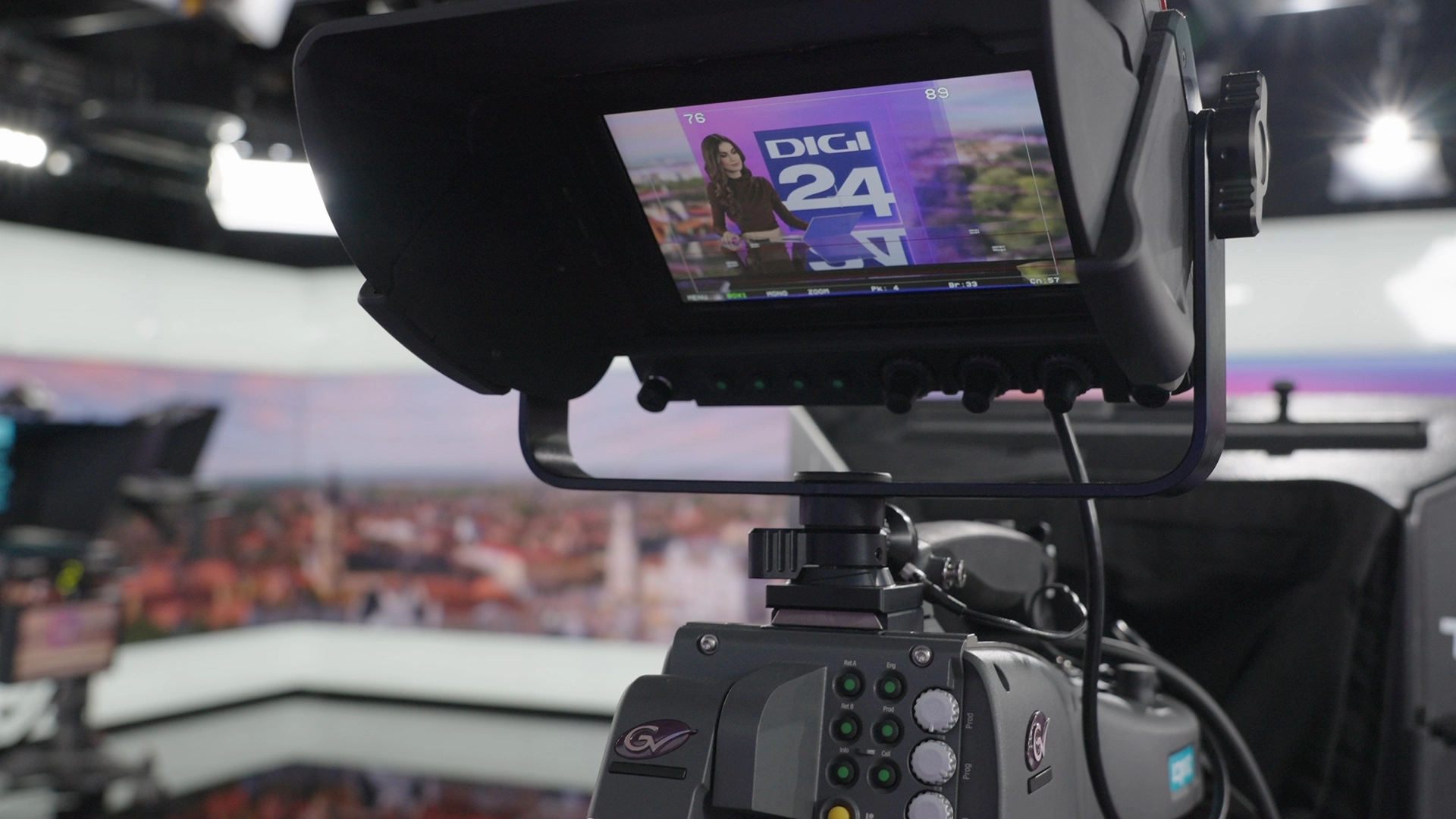
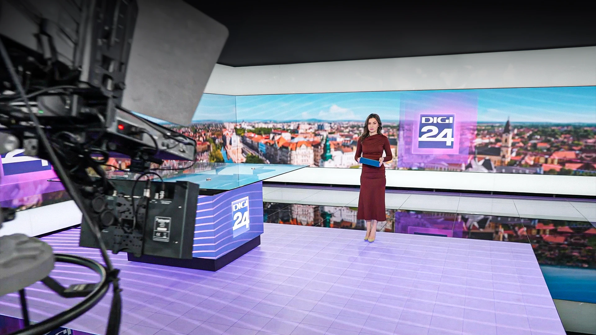

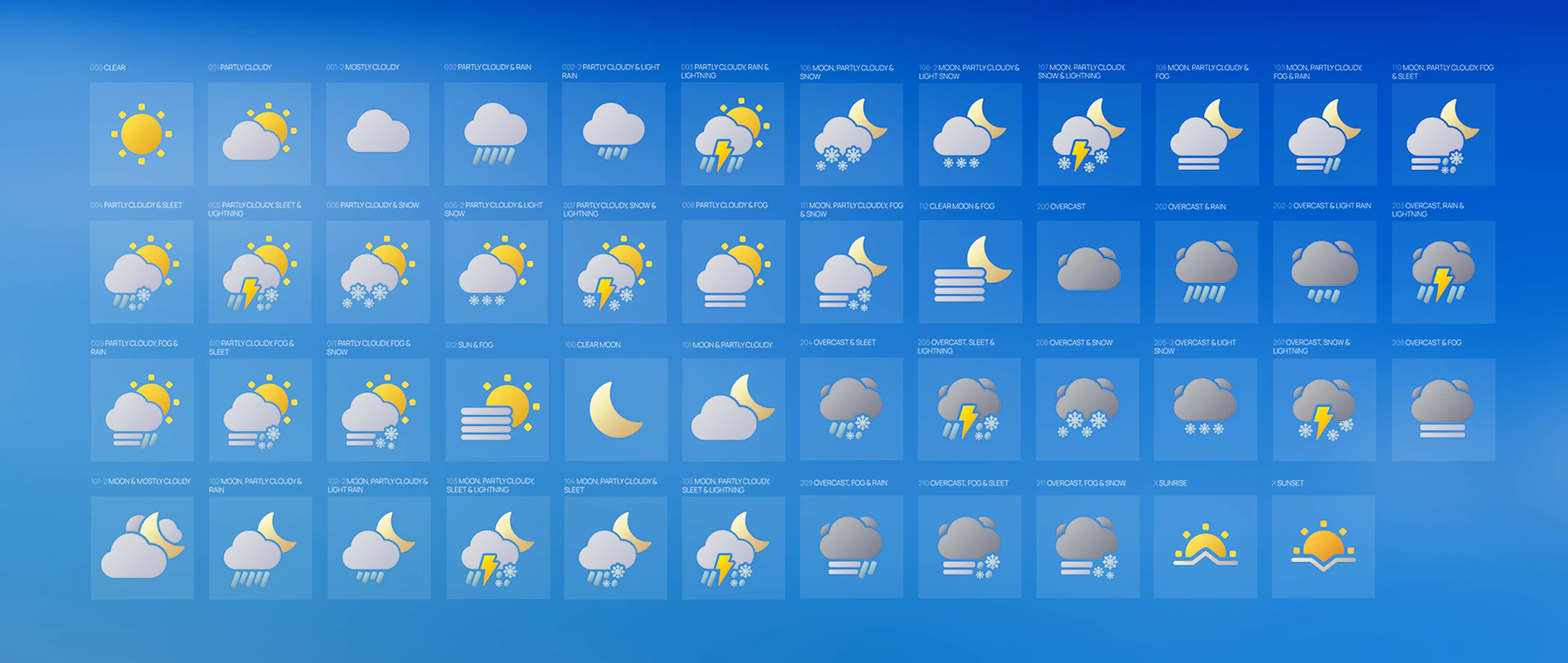
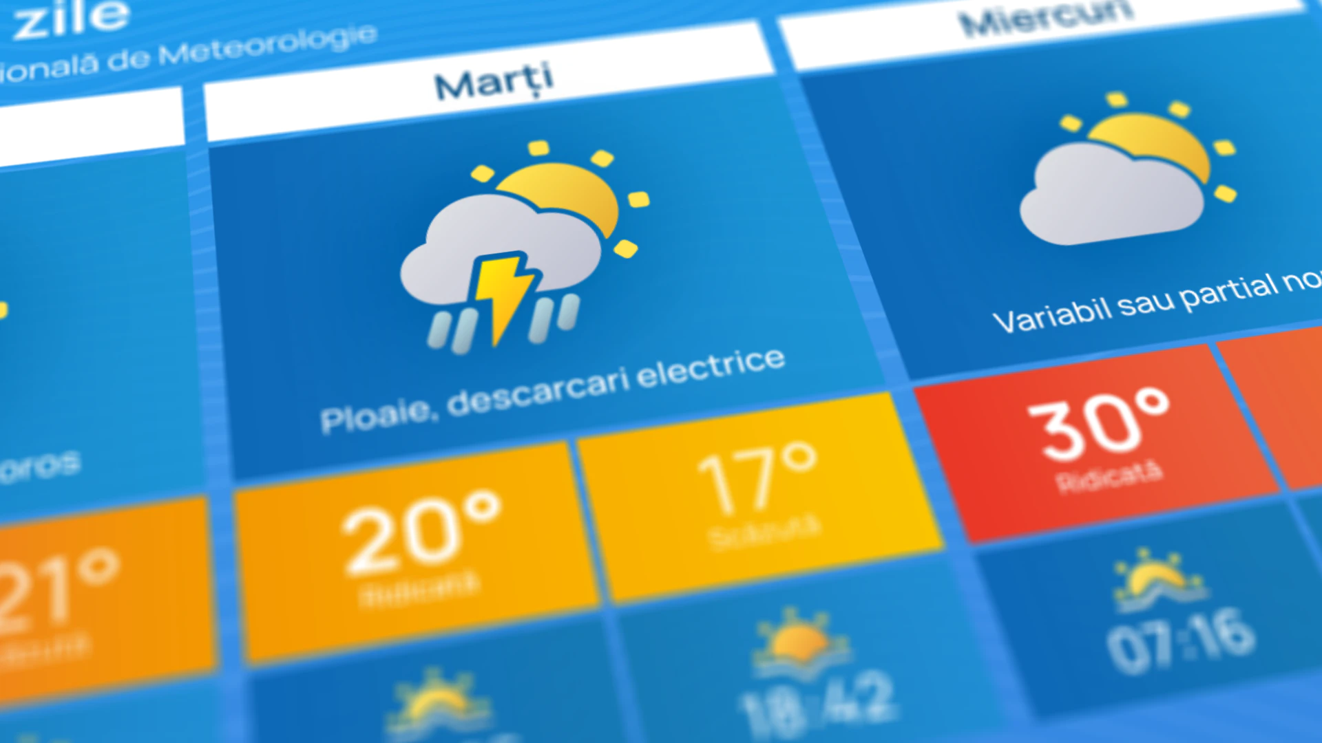
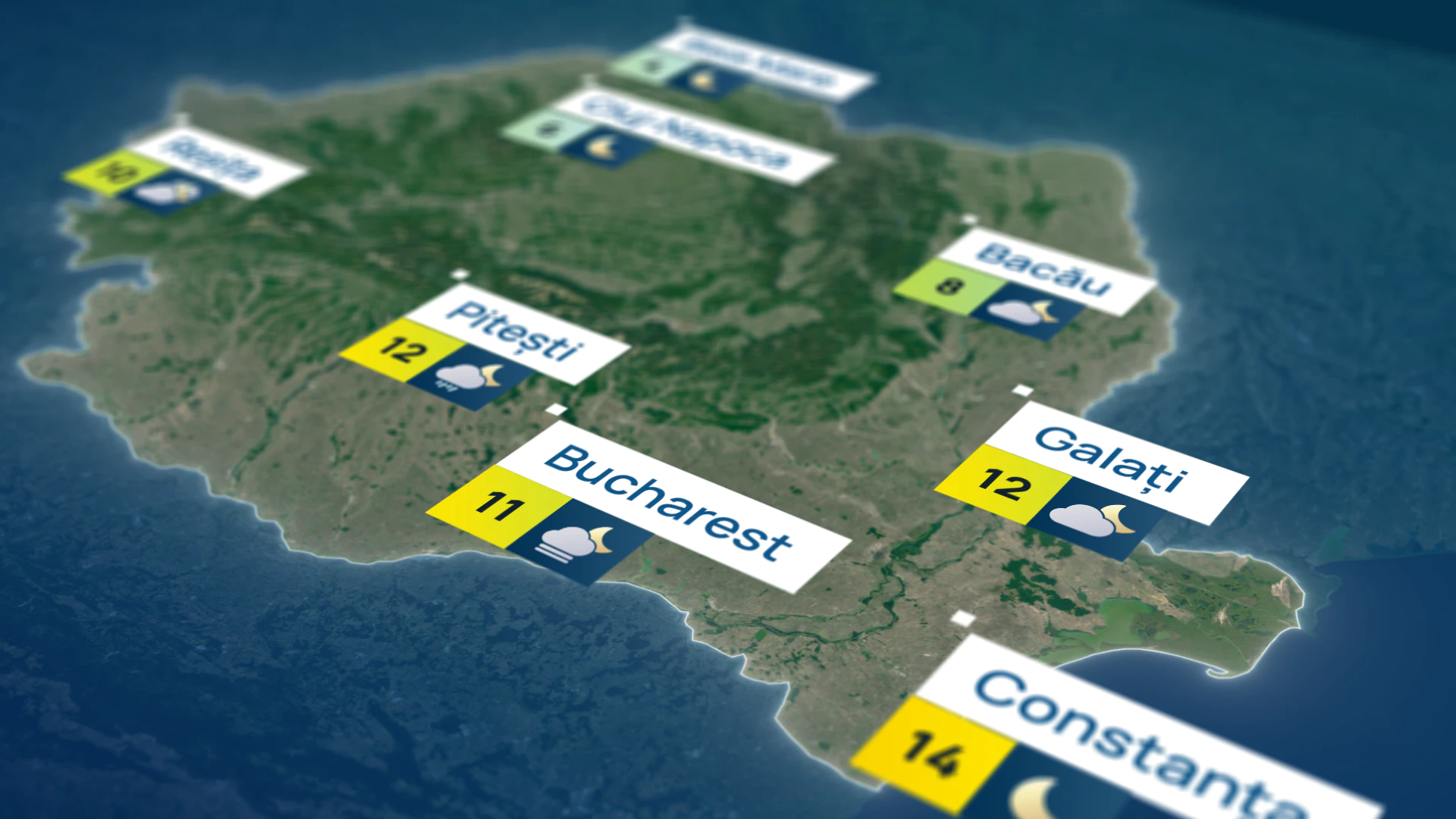
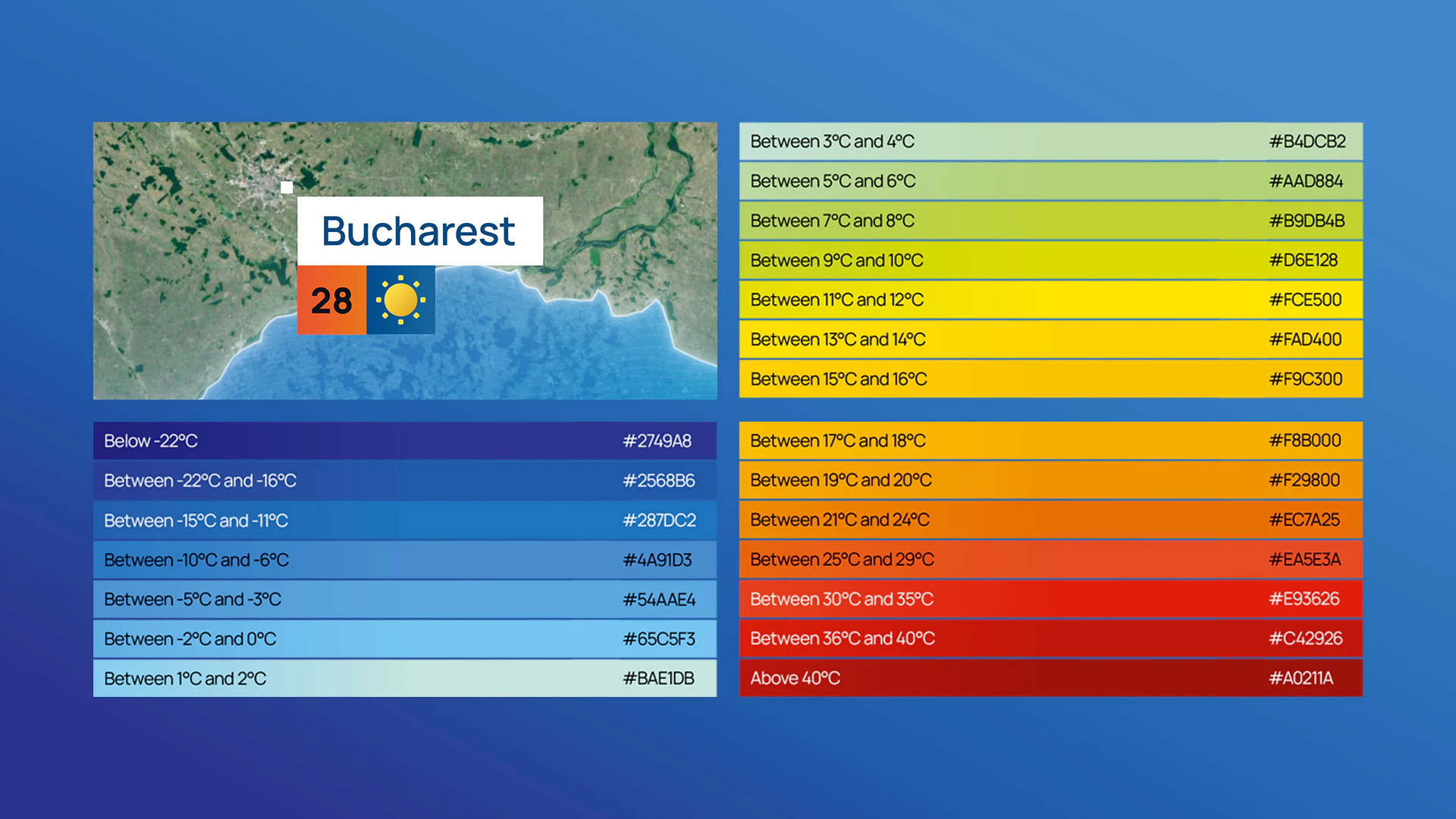
An entirely new weather graphics system was also implemented to fit the new on screen grid system, with a flexible and dynamic set of icons.

The project also required us to consider on screen flow between junctions, commercials and info segments. We devised a series of short idents we called 'blips'. These carry an essence of the Digi24 sonic identity and core visual brand with sub genres for Sport, Weather, Business and Promos. These have been designed to be arranged in any order, creating a seamless join across all on air junctions.
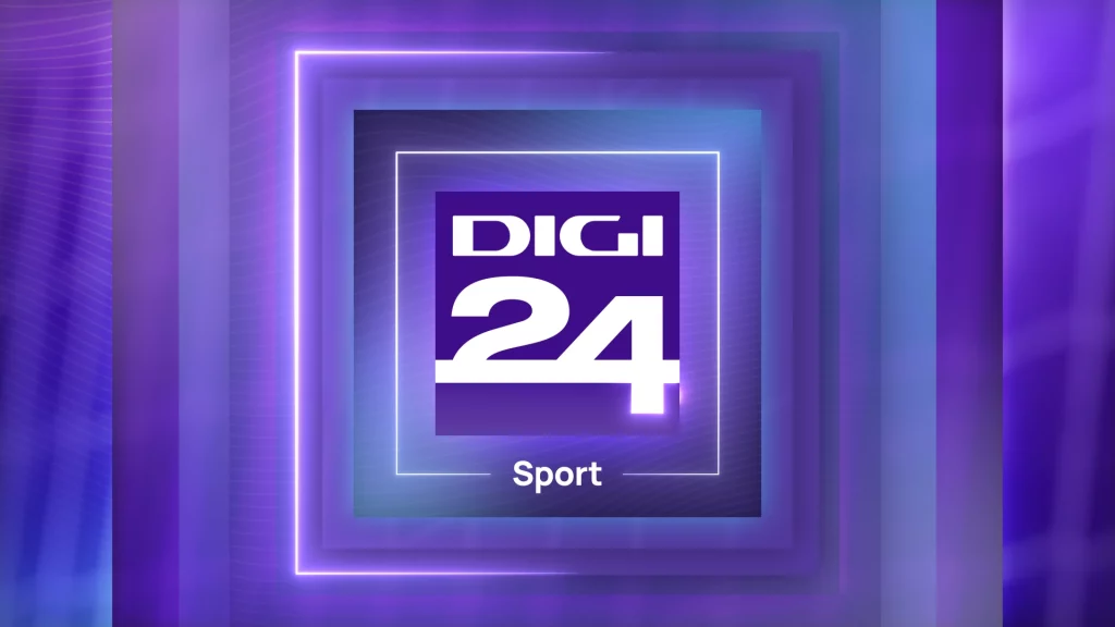
Digi24 - Blips
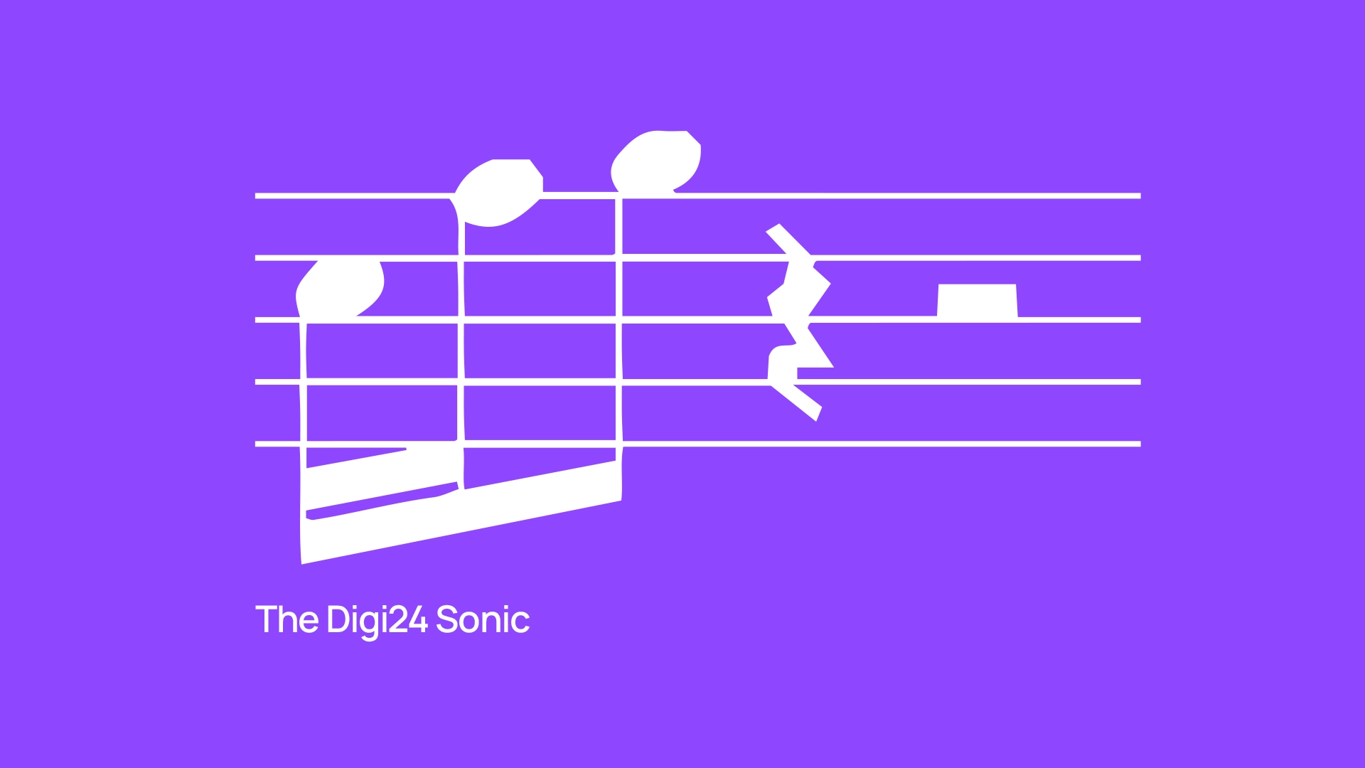
We implemented a sonic branding strategy for the channel in collaboration with Molecular Sound. They created a distinctive three-note melody that's used across the days news, with custom themes for everything from sports to weather, along with special themes for elections and promos.
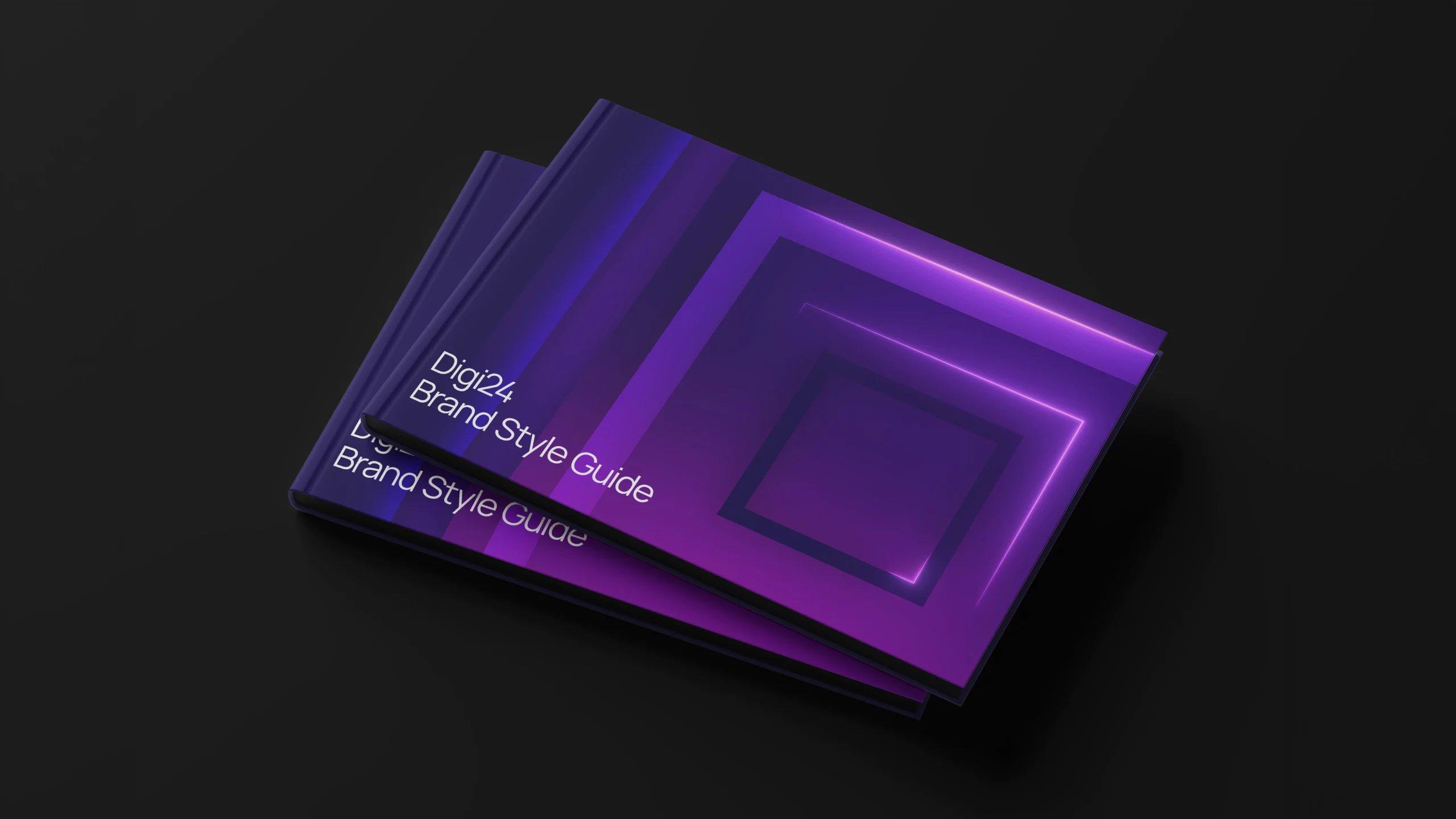
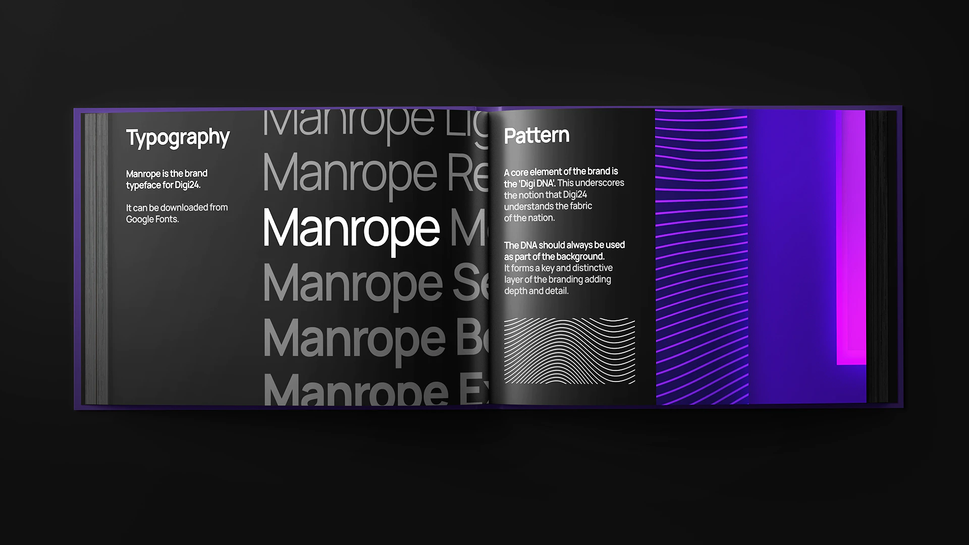
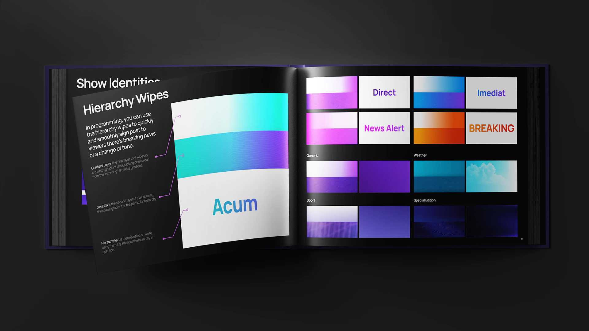
Our final piece of the project was a comprehensive brand style guide. This bible explains the details of the new identity across all visual and verbal communications, reinforcing the refreshed brand identity at every touchpoint for use by design and editorial teams.
Agency: Kemistry
Head of Production: Richard Churchill
Creative Director: James Mobbs
Set Design: Trond Olav Erga
Motion and Brand Design: James Mobbs, Callum Jackson
Music and Sound Design: Molecular Sound
Ident Grade: Matt Jones
Digi24 Executive Editor: Robert Florea
Digi24 Design Leads: Costel Băbuș, Sorin Popa